5 Graphic Design Trends for 2020
Trends come and go, but it is essential for effective graphic design elements to always look up-to-date. Something that may have been an excellent project ten years ago could definitely lead to an outdated image of your products when seen on social media or digital marketing campaigns today. Skillful integration of typography, visual aesthetics and page layout principles can more effectively communicate your brand identity, message, and desired image. Truly effective design choices are implemented not to make your brand fit in with up-to-date images, but rather stand out in a world inundated with digital content.
Have your business make its mark this year and read on to find out more about graphic design trends in 2020. This article will outline 5 trends in graphic design that were powerful last year and will continue to flourish this year and onwards.
Isometric Illustrations
First formalised over 300 years ago and originally used mostly for engineering and mathematical diagrams, “Isometric” images refer to an interesting mix of 2D and 3D imagery - an image in which there are no converging perspective lines, giving an eye-catching look to three-dimensional shapes. Isometric images are all created based on the 120-degree principle (right). When applying the concept to more complex geometry and scenes, the style can look spectacular and futuristic.
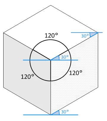
Image attribution: Wikimedia Commons
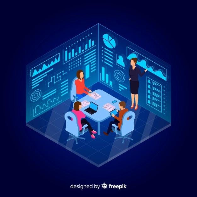
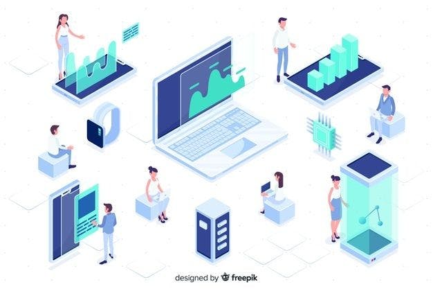

Sources: freepik, 99designs.com
Collage / Mixed Digital Media
Used heavily by media outlets such as Vox or Vice as well as publications like Medium, the use of digital collages is a relatively simple way to create clean, colourful and eye-catching designs. Collages can have a range of styles; from a vintage-surrealist, almost Dadaist look to a more clean-cut and modern style.
These works will typically combine a monochrome image, also often given a halftone look, with some abstract shapes, trendy typography, and often some digitised hand illustrations. Digital collages make heavy use of masks and mattes to arrange layers, and constrain images to certain shapes. They often use a muted, pastel colour palette.
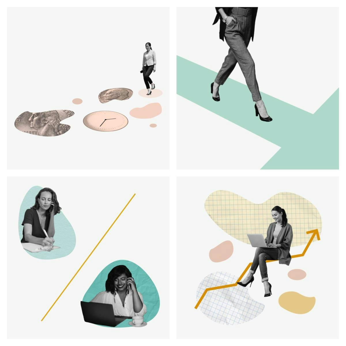
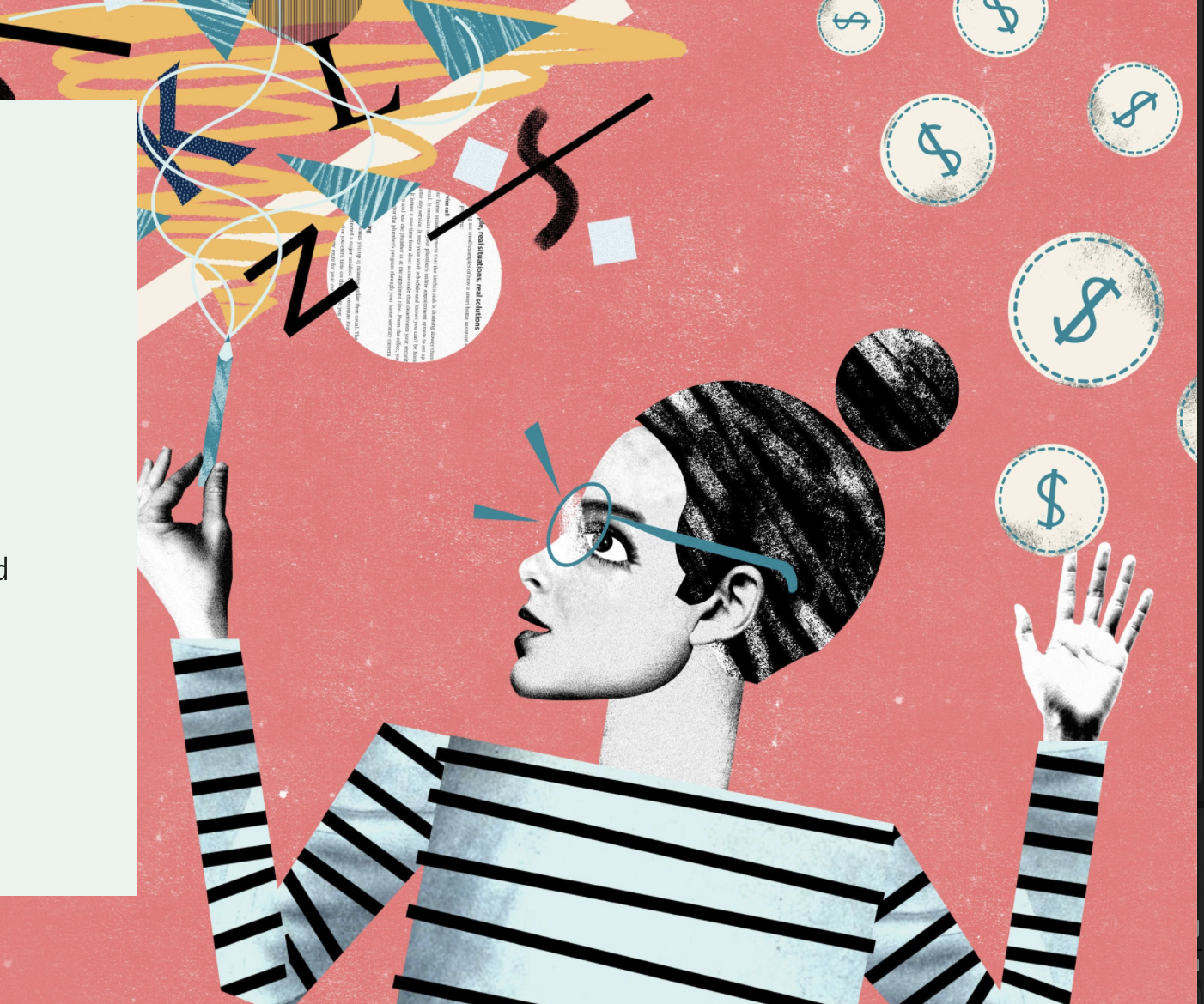
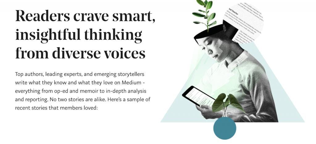
Sources: Ellevext, 99designs, Medium
Analogue media-inspired texturing
One striking feature of the beautiful motion graphics of talented artists such as Ben Mariott is the use of “noise gradients” to give projects visually appealing and colourful ‘noisy’ shading. This gives images a much more organic, almost hand-drawn feeling, and seems more personal than many other purely-digital projects.
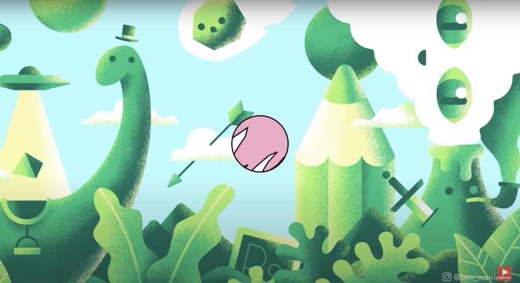
Source: Ben Marriott
For example, in this still from one of Marriott’s YouTube intro clips, very textural ‘noise’ can be seen on the right side of the shape layers. Visible here is the illusion of depth created by layering various gradients and noises with different colours.
This technique of mimicking the textures of paper, watercolour or similar analogue media, somewhat ironically, can make designs seem more prestigious by degrading the quality of an image. Anybody who wants to can get their content onto Instagram, Facebook or an online blog, but print-media is now generally reserved for more high-end applications; and hence the appeal of making a project seem hand-done or lifelike.
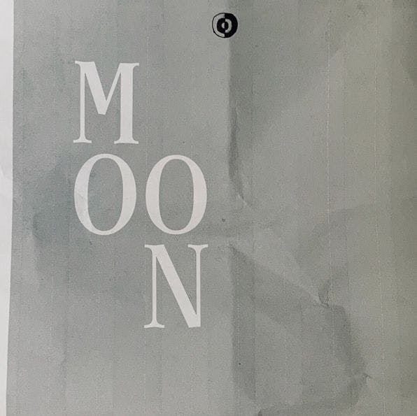
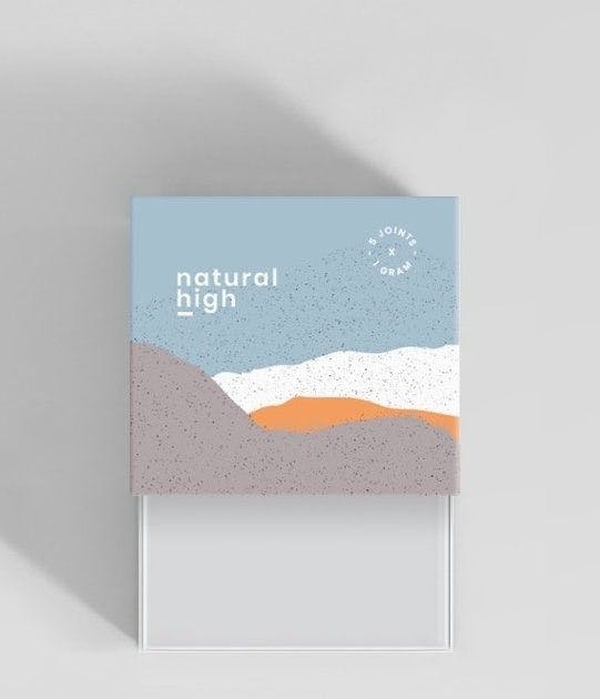
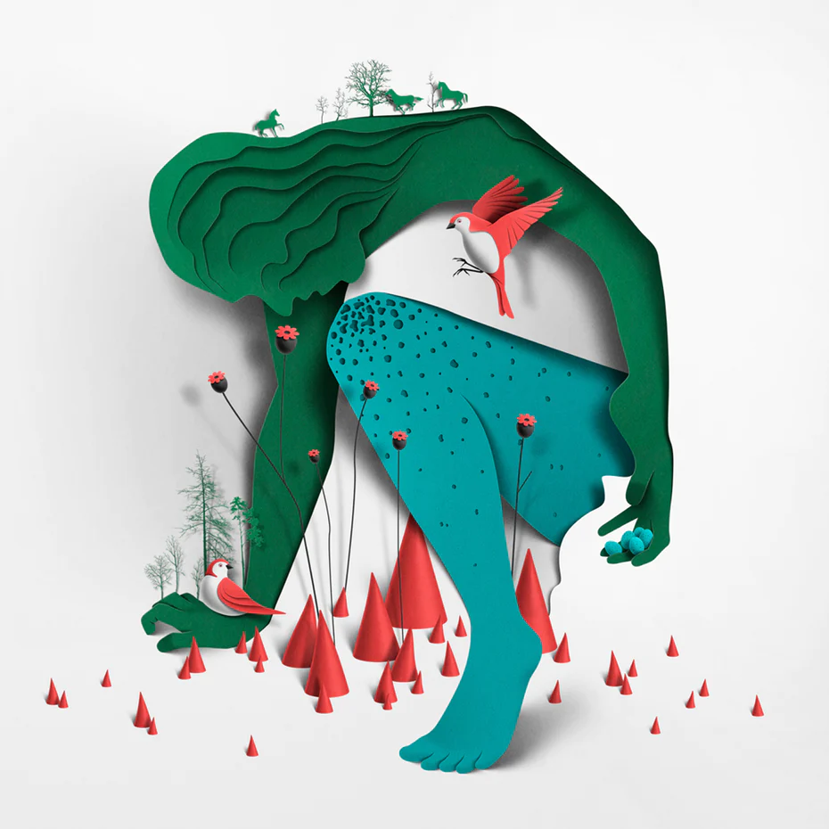
Image Attributions (left to right; 3rdritual, monostudio, Eika Ojala)
Maximalist designs
Hugely maximalist design choices (maximalism being a reaction against minimalism) are a great way to make designs extra eye-catching and pop out from recent trends towards cleaner, minimalist and typically-corporate designs. Reminiscent of artists such as Basquiat, maximalist designs use decadent and overwhelming colour palettes, and intentionally overcrowd images with different textural elements. Maximalist designs go against principles proposed by people like Marie Kondo (think “less is more”) and instead opt for a no-rules-necessary, slather-it-all-on kind of approach.
To make designs more maximalist, don’t be afraid of using really bold and conflicting color palettes, mimicking analogue mediums, or using a collage of a wide variety of elements. Lean into more surrealist elements and busy your canvas up as much as possible. Rather than aiming for clean, calming and slick, maximalist images will make your brand bold, energetic and confident.
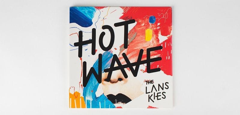
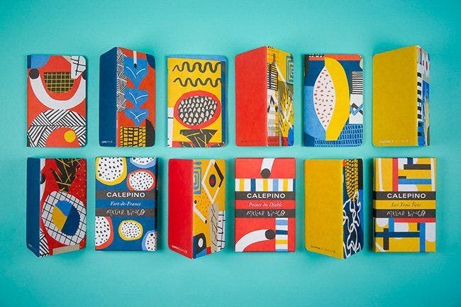
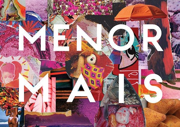
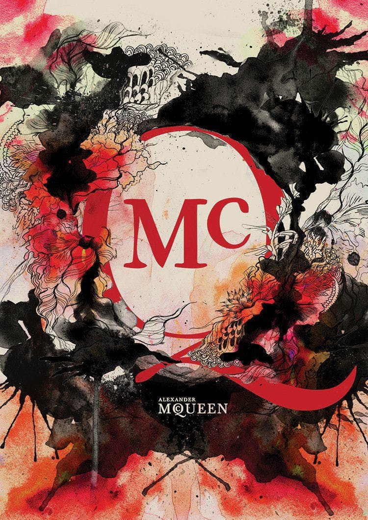
Sources: (top left to bottom right) Gosia Stalinski, Atelier Bingo, Ayla Meridian, Daryl Feril
Animation and Motion Graphics
Want to make your brand stand out from a sea of static social media advertisements that look exactly like each other? Make it move!
Over the last few years, animated brand content has seen a huge surge. Using software like Adobe After Effects for two-dimensional or even Cinema 4D and Houdini for more complex three-dimensional motion designs is increasingly popular. Everything in the real world moves, which makes things like logo animations, kinetic typography and on-brand animations seem all the more appealing. There is a whole other world of trends within animations and motion graphics for 2020, but to get started take a look at studios that have exploded onto the scene in 2019 and 2020, such as Pixelblue or Kurzgesagt, or individual artists such as Ezra Cohen and Ben Marriott.
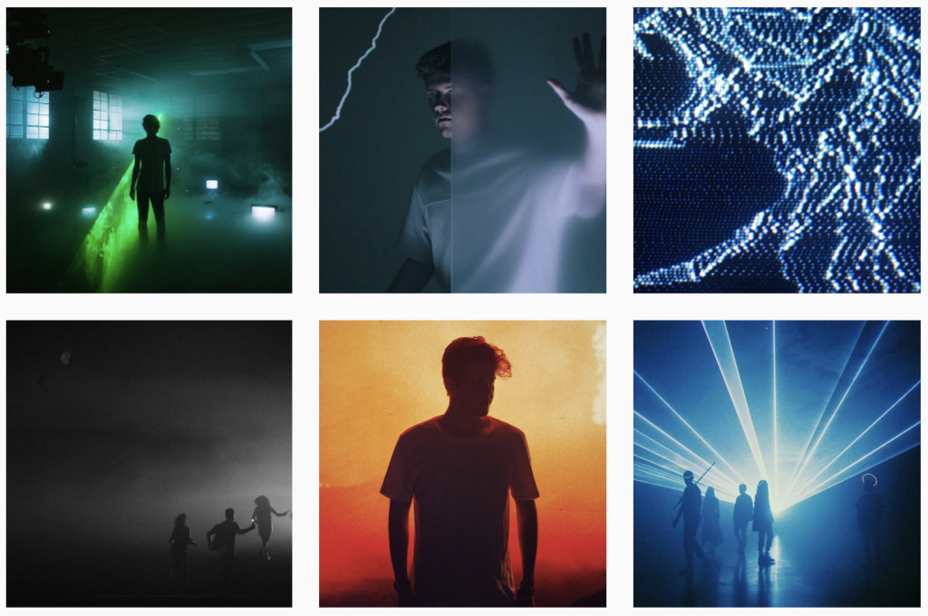
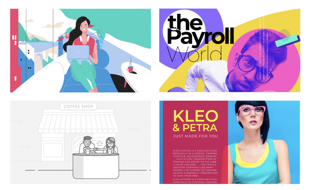
Image Attributions (top to bottom) Ezra Cohen, Pixelblue


