Jeir Creek: Colour of the Year

On the 1st of December 2022, Vice President & General Manager Elley Cheng stood at the Art Basel in Miami to speak about the influence of colour at an “individual level, brand level, at a societal level” prior to the announcement of the ‘PANTONE Colour of 2023’. With this, came the post-pandemic reflection and the importance of colour as a tool for us as individuals to express ourselves after being isolated for so long.
Passing the mic over to Vice President Laurie Pressman, further emphasis was placed on where we are in history and our post-pandemic world. Pressman stated “We’re living in a very unconventional time. In fact, what we would say is that the only thing that’s been conventional during this time is the whole unconventionality of it.” Leading up to the announcement, Laurie tied the unnamed colour to our new way of living and how we now choose to express ourselves more freely through “ingenuity, unconventional ideas and creativity” to create “our own unique journey”.
As we all know it now, the PANTONE Colour of 2023 was ‘PANTONE 18-1750 Viva Magenta’. Along with a promotional video and additional speakers from Ruben Castano of ‘Motorola' and Tati Pastukhova from ‘Artechouse’; ‘Viva Magenta’ was presented as a colour that “welcomes anyone and everyone with the same verve for life and rebellious spirit”.
The motivation behind each of the speakers' voices made the event seem so much more than just colour. So why is the annual event so important?
The Importance of PANTONE’s Colour of the Year

For someone who isn’t a part of or at least interested in the world of design and marketing, PANTONE’s Colour of the Year may seem pointless. For businesses and agencies, its insight can help predict future trends and aesthetics that can be applied to both their own work and clients' work. With PANTONE being the most recognised colour matching system in the world, its importance within the culture of all things visual is immense. Leading brands which we see all around us use PANTONE as a guide for building their visual identities.
Beginning in the year 2000, the team at PANTONE have decided upon the Colour of the Year after extensive research into various industries ranging from entertainment to fashion; in search of commonalities within the realm of colour for that particular year. The colour provides a snapshot into the direction of where culture across the globe is headed.
Jeir Creek Wines Rebrand

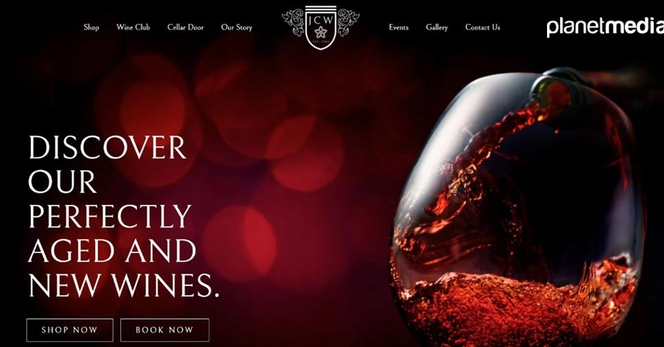
Prior to the announcement of PANTONE’s Colour of the Year, our team worked closely with the team at Jeir Creek Wines to revitalise their brand. Their previous logo had consisted of the native and local Royal Bluebell, accompanied by cursive green text. While the logo represented the region, its design was highly outdated and did not meet the business’ identity as an iconic winery in the Canberra region.
After multiple iterations, both the team and client decided upon a contemporary shield design which features a modern version of Jeir Creeks Royal Bluebell, abbreviated name and year of establishment. However, the logo was not complete without its colour. Through the combination of maroon and gold, a sophisticated yet contemporary and powerful brand identity was able to be built.
Titled ‘Jeir Maroon’, the deep red shares uncanny similarities with Viva Magenta. As a renewal of Jeir Creek after the pandemic, Elley and Laurie’s speeches tie directly into the project's story. The team at Jeir Creek decided to change their ways and refresh the iconic winery in a post-pandemic world. With vigour and courage, the team trusted us with the initial steps to this process through their rebrand and new website. Coming into the new year, the announcement of PANTONE’s Colour of 2023 has helped to reinforce Jeir Creek as a modern and trendy establishment within the Canberra region.
The Importance of Market Research

One key aspect within our work that can help us to identify the prediction of such trends is through our market research. We see research as a key process throughout all our services. As for branding, it is crucial that a rebrand not only catches up to current trends, it must predict them and continue to be relevant into the future. A brand is an investment. It is something a business should be proud of and showcased to the world with honour. While it must appeal to customers through elements such as colour, it should also tie in to the identity and values of the business. In Jeir Creek’s case, the Royal Bluebell remains in place as a symbol for Jeir Creek as a regional Canberran business.
Meeting both the expectations of the business and their customers is not possible without such research. That’s why at Planetmedia, we pride ourselves on our work behind the scenes to create something beautiful for each and every one of our clients. If you are in need of rebranding that not only meets current trends but sets them, talk to us today!


