How to Optimise Your Website for Mobile Search

Chances are, you may be reading this article using a mobile device. In any case, if a mobile user doesn’t like how the website pages are structured or find the readability of the content lacking, they’ll most likely bounce back to another site to find the information and experience they are looking for. Now consider how this scenario would affect your website and just how many users you can lose if you haven't optimised your website for mobile search.

Optimisation means your website should look attractive and engaging on smaller screens. It should load quickly, be smooth to navigate and user-friendly. If your website has taken this into account for mobile users, your site will attract more users, thus boosting conversions.
Here, we’re going to discuss what mobile-first design is and why it is crucial for businesses. Let’s get to it!
What is Mobile Optimisation?
One of the most elementary definitions of mobile optimisation is what modifies your website to be as adaptable and convenient as possible for those who use mobile devices. A few years ago, mobile devices were not that popular, so most website designs were hyper focused on catering for those using desktop screens. Mobile displays, like those on the latest smartphones, have a handful of unique features that desktop-oriented websites can’t address:
- Smaller screens make it more complicated to view full-size pages, specifically for viewing images and content.
- Touch screen interactions make small, precision buttons on desktop websites hard to handle.
- The differences in devices make it complicated to give an all-in-one solution.
- The compatibility of mobile browsers is also not universal, and not all forms of code run on all browsers.
Responsive Design
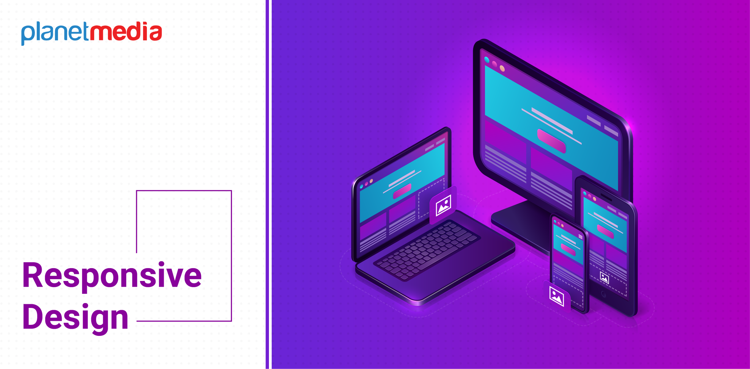
In the past, have you ever opened a site through a mobile device, and had to scroll horizontally to see the entire page? This is because the design is not optimised for mobile devices. It results in not only an inconvenience for the user but also becomes a disadvantage to the website’s search engine performance.

54.8% of web traffic comes from the mobile web. To leverage these opportunities, you must optimise your website for mobile by providing a responsive design. Making the website responsive means that it should adjust the size and design to fit the screen your users view it on.
Leverage Google’s Mobile-Friendly Tool
One of the real smart moves is to look at how your website is already performing based on mobile-friendliness. This will help you put an edge on distinct areas of your website that require work and provide you with appropriate data on how you can make modifications.

One approach is to do this by using your site on different types of devices. Access the website using your own mobile device, and check how it looks and feels. This strategy allows you to get an idea of the loading time, design performance on a smaller screen, content readability, and if the navigation is smooth.
You can delve deeper by using Google's testing tool. One of Google's free test tools will show you if your website is working properly for mobile pages. If the website that you check is mobile-friendly, the tool will provide a positive result. Yet, if Google identifies possible improvements, it’ll point out what modifications you can make to improve the mobile experience.
Even if your website gets an overall good result, it might still experience trouble loading specific elements. In such scenarios, you’ll get a Page loading issues warning once the results are in.
Optimise Content
There is always a chance to make the mistake of keeping the same content on the mobile and desktop devices of your website. While this is not always the wrong approach, remember that the amount of content on the desktop version can be large on a smaller screen. It may also lead to a longer website loading times.

Consider why somebody is browsing your site on a mobile device rather than a desktop. They may be out and about and looking to get the information they need instantly.
Here are some hints to cut down the amount of content a user has to see:
- Swap long content with a shorter content
- Delete images or reduce their size
- Hide irrelevant details out of view in drop-down menus
Optimise Navigation Elements
To feature the right navigational elements on the right devices, it is crucial to identify what users access the most on their mobile devices. With so little space, arranging your menu alphabetically will not extend a decent experience for them.

When mobile users open menus, they prefer the content to be smooth to navigate. Using Google Analytics or any other tools, determine the sections that have more visitors and feature them on your hamburger menu (a preferred method to structuring your navigation menu for mobile devices).
You can also add visual navigation in the main content space so that mobile users can see your leading products or service lists right away.
We are living in a mobile-first world now. Most internet users depend more on mobile gadgets than their desktop systems. Carefully look at how your site works and looks on smaller screens. Optimising your website to perform well and improve the usability on mobile devices is key, especially to avoid possible penalisation by search engines.


