Why You Should Leverage Colour Psychology in Your Branding
For any brand, noticing the importance of pantone is crucial to figuring out how you would like to communicate with your target users. Colour has become a dynamic tool within the visual world, attracting the target audience by influencing their emotions. Researchers say that around 90% of audience perceptions and assessment of a brand is based on colour. Colour can be considered the most decisive factor when developing your brand creatives.
Once you begin to choose the best-suited colours for your brand or business, you may notice patterns in the use of colour in specific industries. Different colour patterns represent different qualities, and is important to consider when using a palette that will depict your brand’s personality best.
As colour patterns are a dominant visual facto, brand personalities are becoming expressed by their use of it to bring about meaning and messages. Picking the right palette is extremely beneficial to your business. At the same time, choosing the wrong colour can have damaging effects – so be careful when selecting which ones to accomplice yourself with. Go for a palette that reflects your brand identity.
Colours and its Impact on User Behaviour
There are two major colour palettes: warm and cool. Warm colours (reds, oranges, yellows) stand for the impression of creativity, friendliness and enthusiasm, whereas a cool palette (blues, purples and greens) mirrors emotions of sophistication, peace and serenity. Here we aim to provide you with an indepth dive into the details of each Pantone and how it may be of use in your brand’s identity:
Red
Colour patterns including red can capture attention quickly in the marketing arena. The colour red encapsulates feeling, passion, excitement, energy, and action. You might have recognised that some businesses use red for ‘buy now’ buttons as an approach to stand out on the shelf. In colour psychology, red is the most energetic colour. Thus, it can influence the strongest feelings. If you use red within your site, save it for the CTA or sale buttons if it’ll balance well with your site design.
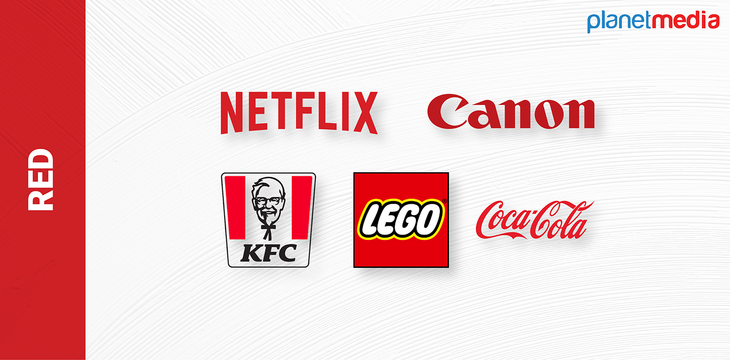
Red is an iconic colour adopted by the brands like Netflix, YouTube, etc. The colour red evokes excitement, hence brands like Netflix use it heavily within their branding. YouTube also utilises the same approach to build up anticipation when users watch content online. Just take a look at how the colour red within their logo (play button) can help influence users to take action.
Blue
While there are different shades of blue that indicate different things, blue is normally related to intensity and stability. Cool blue is comprehended as authentic, reliable, fiscally responsible and secure. Highly related to the sky and sea, blue is placid and extensively well-liked. Blue is a familiar colour with fiscal institutions, as its message of security emboldens trust.
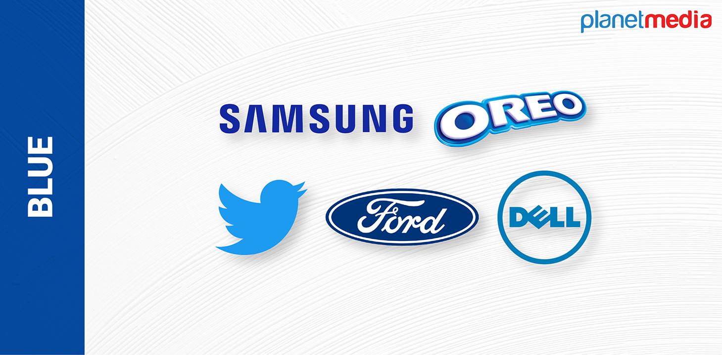
Increasing feelings of peacefulness & trustworthiness, blue is the preferred colour for tech & finance businesses. For example, Facebook and Twitter!
Yellow
Yellow relates to sunshine. It invokes feelings of cheer, positivity, enthusiasm, etc. Some businesses adopt a cheerful yellow colour as the backdrop or border of their website design. You can also choose to use yellow on any ‘free delivery" bar at the top of your site if it goes with the rest of your website’s layout. A little hint of yellow can facilitate your website users to identify something positive.
Snapchat uses yellow with their logo to attract a younger demographic and give them a light & fun experience. Some luxury brands like Ferrari are related to this feeling of happiness, summer and a cheerful lifestyle. Ikea has also famously used yellow in their branding.
Green
Green is deeply associated with nature and money. Progress, productivity, well-being, and hospitality are also related back to the colour green. If your business is in the health or fitness niche, you might choose to use more green in your website. For example, your homepage promotional image or logo might comprise a green element.
The adoption of green is made trendy by brands like John Deere with their complete connection with nature. Their products are related to landscaping, cultivation, lawn care machinery and more. The colour green is so innate to their branding. That way, when someone sees that product, they’ll immediately know it’s a John Deere. Fashion retailers like Roots also use green prominently. Their banner images and marketing materials are made strategically green when browsing, with models typically in outdoor settings.
Here we have discussed a few colours which are effectively used by major brands. You don’t need Apple’s vast resources to take an edge on existing colour research and development, and every brand can take a page out of their colour marketing strategy.
Plan how you pick colours for your brand to reveal its brand identity. Consider both the cool and warm colour themes that represent specific user influences. Perform extensive research into which colours best fit your target user's tastes and requirements.


