White Space and Its Importance in Web Design- A Complete Guide

If you are not a designer, making your website look near-perfect can be a challenge. Applying a quality theme can help a lot, but you’ll also have to understand some underlying principles if you are looking for the best results. This consists of understanding the idea of ‘white space’ in design.

White space is exactly what it sounds like, and despite its noticeable simplicity, it is an indispensable part of any design. Too much white space can make a page look empty, while too little can make your page appear messy. Bringing about the right balance can do a lot for your website’s look and ease of use.
Here we introduce the topic of white space in design. We’ll delve into the concept in detail and show you how to utilise it on your own website.
What is White Space?
White space generally refers to negative space—the unused area around and within visual web design components such as imagery, logos and text. The following explains various types of white space:
- Expanded margins on a page
- Spaces between text sections and those between each letter (kerning in typography)
- The negative space around or inside images
White space attained acceptance in the first half of the 20th century. Since then, designers have noticed its significance and adaptability, usually blending white space into their work.
When designing a site, white space can offset a visual field, direct the audience's eyes to specified areas and even enhance the overall user experience. However, it isn’t as simple as adding or maintaining a white or any solid coloured space either.
Different Types of White Space in Practice
After learning a basic concept about white space in web designing, now is the time to look at the types of white space practices for your website. We can leverage the white space into four distinct categories. Let’s check it out.

- Micro: A micro space is a space between smaller elements like the spacing between letters or the line height. White space in the micro is just as essential as macro white space, if not more, as it enhances user readability.
- Macro: When you apply space between graphic elements, copy, images, etc in your design, that is recognised as macro white space.
- Active: A website that flows evenly and guides the user down to a conversion point (call-to-action, form, etc) is one fine example of active white space. The application of active white space on a web page is aimed to provide structure and flow.
- Passive: Text and graphics generally include passive white space. Using background imagery, videos, textures, and patterns, the concept of white space has been successfully practised. There are many exceptional examples of using white spaces that aren’t white in colour.
Advantages of White Space
A well-balanced design with white space improves the ease of scanning any website. Users can comfortably go through the content smoothly, allowing them to identify what they are looking for:

- Increased Content Readability: When users are on your website, they should easily view any content on the current page, providing them with a clear definition of the information. White space between each paragraph and around blocks of text and images helps the audience to understand what they are reading and provides a better user experience overall.
- More Interaction: Generally, there is a specific objective behind every live website. Some sites are designed to boost product sales or downloads while some are intended to build up viewers for a specific blog or video.
- Highlighting Call to Actions (CTAs): At times, the most evident way to make something exceptional is to make things more significant. You can put bigger images or buttons. However, adding white space to the surrounding of the item can be very effective.
- Improve Website Loading Speed: Removing irrelevant information, designs, and sections from your site, will help to create a clean look for your website. When you cut elements from your website appearance, you are using fewer widgets or blocks, which helps make your site lighter. Moreover, such websites load faster than heavier ones. Therefore, you get a better ranking on search engines.
- Acts as a Separator: White space detaches inappropriate elements in a design. It can be employed to separate images/graphics from each other and makes your overall visual layout better. The application of proper white space paves the way to a more clear-cut communication of ideas and dynamic designs.
Things to Consider
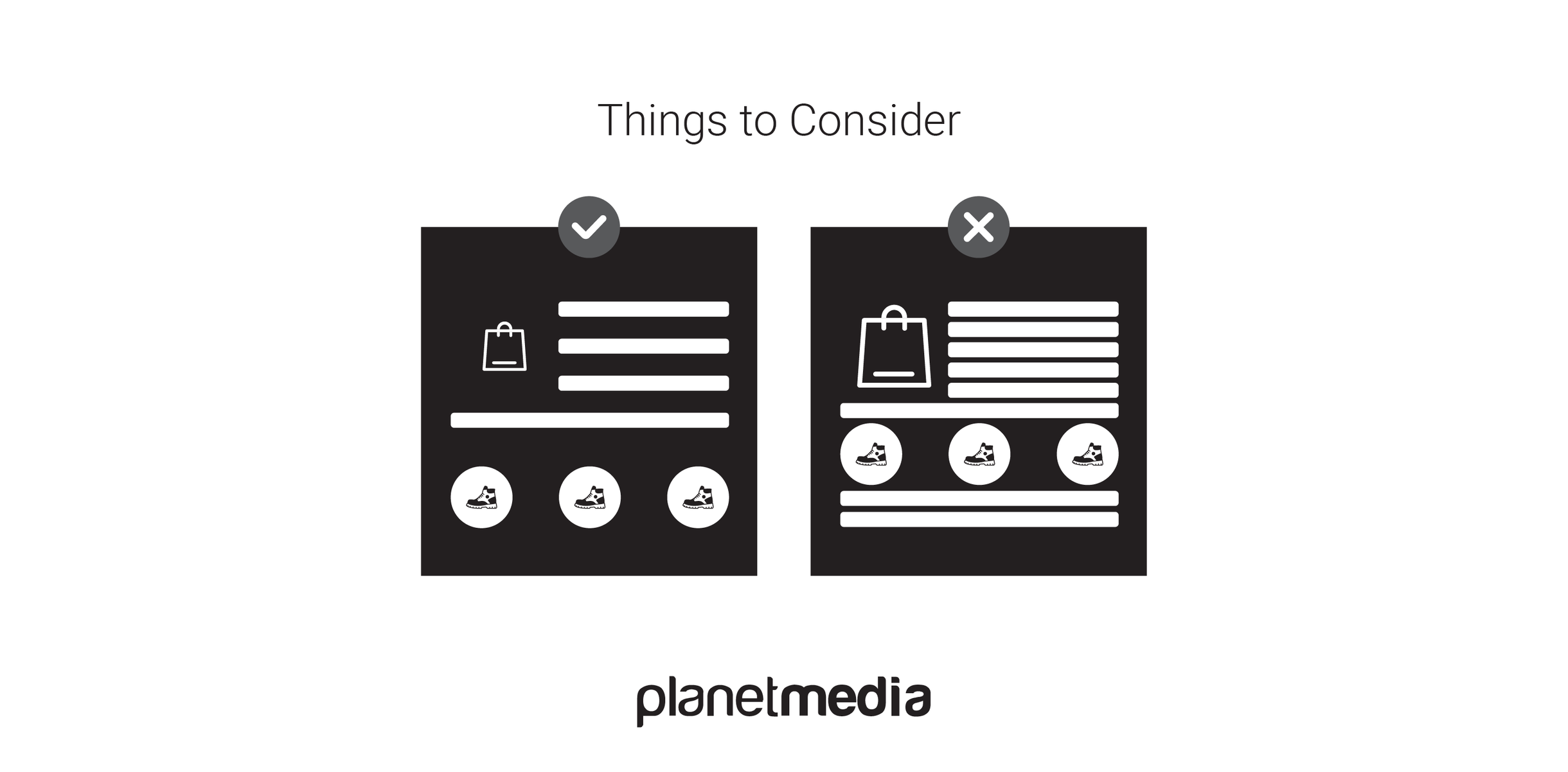
With all of these great perks, we need to consider how white space can often be underappreciated and removed from a design. To prevent this, we have to understand why it develops and how to fix it.

- Designer vs. Developer: A designer designs an excellent layout. The layout is shared with the developer then hands it back to the designer, although now the layout looks completely different compared to what the designer initially intended. Before starting the development, the designer and developer must work together and discuss layout wireframes, highlight and point out padding, plan out margins and line heights and all the other design elements of your website to avoid any confusion.
- The Fold: White space is usually overlooked and pushed out of a design because some people within the company like to include as much content as possible, high on the page, thus removing any white space from the site. It is essential to remember that we do not have any idea about where users may decide where to start scrolling. Where the fold lies on an audience’s screen is impossible to notice, so in the end, the fold is not worth bothering about.
- Demonstrating Your Design: Interacting with your client and demonstrating your motive and principle is important. Designers have to explain in terms that clients can understand rather than briefing it out. Knowing the details is essential, as is demonstrating them.
When it comes to applying a white space on your website, balance is key. Without adequate white space, your web pages will begin to feel cluttered and complicated, while too much white space offers no clear structure. To avoid those problems, use negative space strategically to display both closely associated elements and those that are independent and distinct. We hope this guide will help you leverage white space effectively on your website to improve both its success and user experience.


